Below are some images of pop magazine logos.


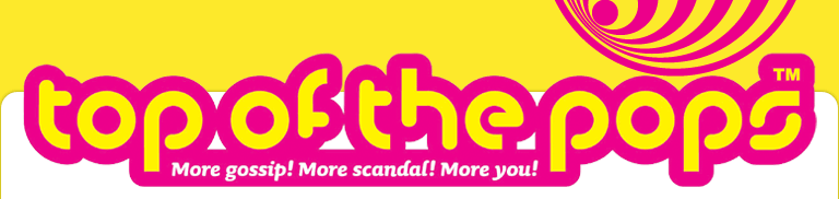
Top of the Pops and Popstar! are magazines focused all about pop music, and Billboard and Rolling Stone magazines are a hybrid genre magazines, focusing on chart music or music in general, although the majority of it is pop music.
The names of each magazine are short, sharp and easy to remember. The colours of the magazines are very bright, using colours like the primary colours, such as reds, yellows, blues and also pinks. The fonts used are modern and eye-catching. Top of the Pops and Popstar! logos look very 'poppy' and definitely aimed at pre-teens/teenagers and at girls. This is because of the colours and the style of writing. Billboard and Rolling Stone look like they're aimed at both genders and an older teen market.
My magazine name should be simple, and short. I have decided to aim my magazine at modern pop and classic pop music. Therefore the title should reflect this as should the colours and the font.
I think for the name of my magazine, I have a few ideas;
- AGPop or AGP magazine standing for 'all genre pop'.
- Classic Pop
- Hollywood Tonight
- Jam
- Pop Junkie
- Pop Life
The names are short and simple and easily remembered. Like Rolling Stone magazine, some of the names are from songs or a play on words, which I think fit in perfectly for a music magazine. I will chose a range of fonts and then do a survey to find out what people find the most attractive
Excellent idea!
ReplyDelete