Friday, 31 December 2010
Feedback
Well done, Phoebe - virtually all planning done and evident on blog. Just some risk assessments and possibly a few plans for using the two weeks when we get back... Article is excellent and some promising photography work - you may just want to reshoot one or two to avoid chopping off the top of Amy's head - it wouldn't take long, as you know exactly the poses you want.... I look forward to seeing you start creating your pages...
Friday, 17 December 2010
Magazine photographs; front cover and contents page.
For the front cover and contents page of my magazine, I used the college studio to take my photographs. I took over 200 photos because this way I would have more choice for my magazine. I took a range of different shots; extreme close up, close up, medium close up and long shots. I also did different angles, low angle, high angle and canted angle. I also got my artist to stand in different positions, with different facial expressions. Below are possible pictures I will use for either my front cover or contents page.


This is one of the photographs I took. It is a close up and if I were to use it, it would be for my front cover. I like this one because she is looking straight in to the camera and smiling slightly. She is well lit so her face can be clearly seen. Looking into the camera helps for the artist to connect with the magazine buyer, also her body is bent towards the camera which also helps for her to connect with the reader. It is also a slightly low angle. The problem with this is that I have cut off some of her head, so this probably couldn't be used as a front cover.

This one is a medium close up. This would also be good for a front cover, because again she is looking in to the camera with her body facing forwards- like most magazine covers are. The fan was on whilst taking this, so her hair is moving which makes the picture look more alive and interesting. Fans are commonly used on magazine covers or contents pages.


The last two would be good to use as contents page because the text could easily fit around the images. The top one is a long high angle shot and the bottom one is a medium shot. She's looking in to the camera which helps her inteact with the reader and it's a different position to the front cover which makes it more interesting and adds variety.
Wednesday, 15 December 2010
Lists of equipment needed.
For my photographs, I will need to think about if I will have any props, what colours will be use, costume etc.
Props:
Props:
- Front cover- nothing.
- Contents page- Balloons?
- Double page article: Main Photo: Balloons? Photostrip: Kittens.
- Black
- White
- Bright colours.
- Fashionable clothing-
- leggins
- over-sized jumpers
- Curly/Wavey hair.
- High heels
- Painted nails.
- Medium Close up- front
- Long shot- contents page
- Close ups- photostrip
- Medium/long shot- main picture
Re-worked magazine article.
“IT'S ALL A BIT CRAZY, ISN'T IT?”
Princess of Pop, AMY GOULDSBROUGH, speaks exclusively to Pop Life. We catch up with the rising star as she discusses her new album, Katy Perry and Hollywood…
After the enormous success of her last album, and a year away from the spot light, she’s back! back with a bang! Not only is the album’s debut single, Bearded Kittens, racing towards the Number One spot, Amy has just signed a £50million contract deal with Sony Records.
Mild-mannered and shy don’t seem like the typical words to describe a pop star, but that’s exactly what she is. As she sits in her room, surrounded by pink walls plastered with band posters, she looks every bit the normal teenager, except she’s anything but. She’s the girl who has achieved 3 consecutive Number Ones and has had her album at Number One in the charts for 16 weeks straight- at just 16! “It’s all a bit crazy, isn’t it?” blue-eyed Amy smiles. “I never thought I’d be here; the amount of success I’ve had is amazing. I’m really lucky.”
Lucky, indeed! Only last year she was living in a semi-detached house in North West England, now it’s all about fancy restaurants, expensive shopping trips and luxurious holidays. But don’t think she’s not thankful for everything she’s received. “I think it’s important not to forget your roots, you know, who brought you here. I don’t think I would be where I am without the love and support I’ve gotten from my family and friends. I’m definitely living the dream now, though!”
Amy may be relatively new to the music scene, but it doesn’t mean the rumours haven’t started. “Yeah I’ve had a lot of bad press from the media lately. (The MTV awards incident with Miley Cyrus) I don’t want to go in to it, but, you know, I just want everyone who reads Pop Life to know that you shouldn’t believe everything you read in the tabloid newspapers. That stuff’s kinda hurtful," Amy sighs with a heavy heart. Not that bad press has ever stopped her. Her last album, Be Not Always, reached Number One and stayed there for 16 weeks, with three singles Be Not Always, Dance Nation and Get Down (On the Floor) all reaching Number One, all highly impressive for a début album.
Her last album produced up-beat, 70s-styled-disco, mixed with a modern pop sound; however, her latest album is a far cry from her previous one. “I wanted to do something different. Push the boundaries. It’s more…fun in comparison to my first album. The world’s a bit crap at the moment. I just wanna inject some fun and life in to it. Don’t take life too seriously.” She adds, “Hopefully, it’ll be more successful as my last.”
Well, with the first single, Bearded Kittens, well on its way to Number One, it’s looking that way and it’s been given good reviews from critics, with one claiming it’s “going to be the album of the decade” and another saying “she’s a new, young Beyoncé.” Big stars such as Katy Perry, Take That and will.i.am have all said they would love to collaborate with Amy, hailing her as “the next big thing.” The young star beams, “I’d love to work with Katy! She’s one of the reasons why I got into music.”
It seems like it’s all good news for Amy. Reports claim she has been offered a role in a big Hollywood film. Amy shyly turns her head away and says she can’t discuss that. Whether she’s going to Hollywood or not, all we know is that her first priority is still her music, “I’m very passionate about music, it’s what makes me tick and I hope I’ll be around for a very long time.”
All we can say is that we think she’s a new pop legend in the making.
This is my second version of the article. I have changed some things such as grammar and sentencing. The re-drafted article is often better than the original because it has been checked over for any mistakes in spelling or grammar and it reads and flows better. This makes it more sound professional and easily and enjoyable to read.
This is my second version of the article. I have changed some things such as grammar and sentencing. The re-drafted article is often better than the original because it has been checked over for any mistakes in spelling or grammar and it reads and flows better. This makes it more sound professional and easily and enjoyable to read.
Organisation of time during college hours.
This is a time table of how I will spend my remaining time during college before half term working on my blog. I will use frees and lesson time to help me do the most on my blog before half term.
Over the half term, I will carry on working on my blog making sure posts are up to the best standard and there is nothing else to add. Also, duing the half term I will take the remainder of my photographs for my contents page and double page article.
Once I return after the half term, I will carry on producing my magazine. Making sure it is all completed to an excellent standard before the 10 weeks are over.
The two weeks I have after half term I will be focusing on creating my magazine covers. If I am able to; I may stay behind after college one night a week to continue on the magazine and get a little more done. I will carry on with my front cover but I will do a bit on every page each lesson.
Saturday, 11 December 2010
Feedback
This is looking super, Phoebe - you have produced some good quality research and planning - just make sure you finish off any remaining tasks this week. I am really pleased with the work you have done.
My magazine article first draft.
Headline: It's all a bit crazy, isn't it. (quote from text)
Subheading: Princess of Pop, AMY GOULDSBROUGH, speaks exclusively to Pop Life. We catch up with the rising star as she discusses her new album, Katy Perry and Hollywood…
After the enormous success of her last album, she’s back! And she’s back with a bang! Not only is her debut single ‘Bearded Kittens’ racing towards the number one spot, Amy has just signed a £50million contact deal with Sony Records.
Mild-mannered and shy doesn’t seem like the typical words to describe a pop star, but that’s exactly what she is. As she sits in her room, surrounded by pink walls plastered with band posters, she looks every bit the normal teenager, except she’s anything but. She’s the girl who has achieved 3 consecutive number ones and has had her album at number one in the charts for 16 weeks straight- at just 16. "It’s all a bit crazy, isn’t it?" The wide, blue-eyed Amy smiled. "I never thought I’d be here, the amount of success I’ve had is amazing. I’m really lucky."
Lucky indeed, only last year she was living in a semi-detached house in North West England, now it’s all about fancy restaurants, expensive shopping trips and luxurious holidays, but don’t think she’s not thankful for everything she’s received. "I think it’s important not to forget your roots, you know, who brought you here. I don’t think I would be where I am without the love and support I’ve gotten from my family and friends. I’m definitely living the dream now though."
Amy may be relatively new to the music scene, but it doesn’t mean the rumours from the media haven’t started, "yeah I’ve had a lot of bad press from the media lately. I don’t want to go in to it, but you know I just want everyone who reads Pop Life to know that you shouldn’t believe everything you read in the tabloid newspapers. That stuff’s kinda hurtful", Amy sighs with a heavy heart. Not that this bad press is stopping her from going to the top spot. Her last album "Be Not Always" reached the number one spot and stayed at number one for 16 weeks, with three singles "Be Not Always", "Dance Nation" and "Get Down (On the Floor)" all reaching number one, which is very impressive for a début album.
Her last album produced an up-beat, 70s-styled-disco, mixed with modern pop sound; however, her latest album is a far cry from her previous. "I wanted to do something different. Push the boundaries. It’s more…fun in comparison to my first album. The world’s a bit…crap at the moment. I just wanna inject some fun and life in to it. Don’t take life seriously." She added, "Hopefully; it’ll be more successful as my last."
Well, with the first single "Bearded Kittens" well on its way to number one, it’s looking that way, and it’s been given good reviews from critics, with one claiming it’s "going to be the album of the decade." And with another saying "she’s a new, young Beyonce." Also big stars such as Katy Perry, Take That and will.i.am said that they would love to collaborate with Amy saying she’s "the next big thing." The young star beamed, "I’d love to work with Katy Perry, she is one of the reasons why I got in to music."
It seems like it is good news after the other for Amy; reports have claimed that Amy has been offered a roll in a big Hollywood film. Amy shyly turns her head away and says she can’t discuss that. Whether she’s going to Hollywood or not, all we know is that her first priority is music, "I’m very passionate about music. I hope I’ll be around for a very long time."
All we can say is watch this space.
Magazine Article.
This is part of an article from Q magazine. I am going to analyse the writing style of the magazine and this will help me to make sure my article is in the same writing style which will make it seem more professional.
"
ARCADE FIRE. BAND OF THE YEAR.
Teetering on a narrow metal rail in the middle of Madison Square Garden, Win Butler is enjoying a Rock Star Moment. If in the past there has always been a slightly tentative air about him as a frontman, tonight, on this, the second of Arcade Fire's rammed-to-the-rafters shows at the hallowed New York venue, his hesitancy appears to have gloriously evaporated. Midway through a pounding take on We Used To Wait, he exits the stage and enters the crowd, picking his way through them by attempting to balance like a tightrope walker on the lip of the safety barrier running all the way up the left hand side of the arena- not the simplest of tasks when you're 6'4" tall and in possession of size 15 feet.
Surrounding him are 19,500 ardent Arcade Fire fans, here witnessing what is effectively the launch of the Montreal septet's third album, The Suburbs, released two days previously here on 3 August; out there in broadbandland, another 1.8 million people are viewing his precarious antics via a live webcast being supervised by film director Terry Gilliam. Far behind him, onstage, the other members of Arcade Fire plough on through the song, while watching their now apparently fearless leader's preogress with a mixture of trepidation and delight.
Pummelling a piano centre stage, Butler's petite corkscrew-haired wife, Regine Chassagne is thinking, "Go,Win!" as her husband keeps a careful eye on this footing and-as he will later admit- firmly concentrates on "not falling to my death". Elsewhere, stage left, his younger brother Will Butler- like most of his bandmates a multi-instrumentalist, and the one most likely to perform such hair-raising stunts during an Arcade Fire show-thumps the keys of a vintage synth and views his sibling's escapade with an experienced eye. As the singer moves to the arena floor and is swollowed bythe mass, Will knows his brother will be alright. "Normally," he will later note, sagely, "you can tell by the state of the barricade if you're gonna get your shirt ripped off or if you're gonna be OK."
Presentation 1
This will help me when I write my article. Things I will need to keep in mind is;
- Not have too much text.
- Use text grabs, different coloured fonts etc to get attention
- Get to the point straight away so the reader knows what you are talking about
- Short sentences and paragraphs
- A mixture of informal and formal text, with no grammar or spelling errors.
Equipment and technology.
In order to complete my magazine and make it look as professional as possible, I will be using a range of different equipments and technologys.

- I will be using a camera from college to take my photographs

- Using different lights to get the best possible photos. This helps for my pictures to be well lit, this is especially important for the front cover.
- Using Photoshop to cut out pictures proficiently. Also, to edit pictures, for example changing the lighting, colour, adding effects etc.
- Using In Design in order to make my magazine.


Friday, 10 December 2010
Final Font Choice.
I have asked 10 people which colour in my font they liked the most. The results are as followed:
 The third font got the most votes, however, I'm not sure that is the best one to use for my magazine. It stands out, but it's not my favourite. I think I will use the yellow one because it stands out a lot and seems more 'poppy' than the others.

Magazine Layouts; Front cover, contents and double page article.

This is the layout for my front cover of my magazine. It's going to be a close up shot of my artist on the front, and no other images. Music magazines usually have a main focus of one artist on the front and just mention the names of the other artists featured in the magazine. I will put the artist center of the magazine with text around it. I haven't drawn my layout to scale, so the text boxes in my drawing are too small for text without it interfering with the image, so I will have to bring down some of the text boxes. There is also a barcode at the bottom with the website name and price of the magazine. And at the top next to my magazine name, there is the date and issue number of the magazine.
The image on the front will be in colour, and the writing of the text will be in colours such as black, red, pinks or purples etc. I am planning on having the background white, which is why black, red etc are good colours to use because they can been seen easily and are readable.

This is the contents page for my magazine. There will be three images on this, the biggest picture is of my main artist and the other two is of another artist who will be featured in the magazine. The big picture of my main artist will be in colour and the smaller images will be in black and white. I have headings such as "features" and "every week", showing what'll be in my magazine. Contents is at the top of the page with the date and the issue number again, also I have put the website name on there again incase they didn't see it on the front.
The text colours again will carry on from the front page, black, red, pinks etc.

This is my draft for my double page article. I will have four pictures on this. There will be a large main photo on the left hand side of the page, I have decided that this will be either a close up or a medium close up. At the right hand side, above the text, there will be a photostrip of three pictures. These will be a close up shot.
The headline will be a quote from the text, so it'll be in quotation marks. It will be also in large letters and, because I think my heading will be "it's all a bit crazy, isn't it," I will make the word "crazy" larger than the rest and in a different font; making it look more interesting. Underneath this there will be a little sub-heading, explaining a little about the article.
I will use a drop capital letter on the first letter of my first word (for example if the first word was "the" "T" would be larger than the rest of the word.) The text will be split up in three collumns because I think it looks more attractive and more professional that way. There'll be several text grabs used, to draw attention to specific words and phrases.
For colours, I will try to carry on the theme from the rest of my magazine, using the same colours etc. The headline will be in colour, with the word "crazy" in a different colour to the rest of the text. The sub-heading and text of the writing will be in black because it is the most legible colour, meaning no one will be straining their eyes to try to read it. The text grabs will be in the same colour that the word "crazy" will be in, just to keep a theme going and also having too many different colours can make it look messy or a bit busy. The background will be white.
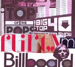
Magazine layout inspiration.

This Billboard magazine cover inspired my front cover. I like the positioning of Lily Allen because she is looking in to the camera, and it's a close up shot which is what most front covers have. It makes the artist and magazine look inviting and welcoming and it stands out and makes you want to pick up the magazine and read it. I changed mine slightly, for example I wont have the person on the cover of my magazine covering up the heading.

This contens page in Q magazine inspired my contents page. I like the layout of it because it's simple but attractive and interesting. I have change the design slightly to fit my genre more and I will look at more suitable colours for my magazine, rather than reds and black.
My double page article was an idea of my own and one was inspired from a page in OK magazine.
Wednesday, 8 December 2010
Fonts
I have decided to change my font from number 5 to number 8. This is because I think it looks more poppy, it's clearer and more attractive. It got a lot of votes, so I know people like it.


I have kept "pop" together and spaced out "life". It was done by accident at first, but I decided I liked it and I am going to keep my font in that style. I think it looks different and also the "life" being spaced out can suggest pop life, through different eras. A more spaced out and wider range of pop music, rather than just current pop music.
For font colour, I have decided that I'll do the word "pop life" in black with the 'o' in pop coloured in. I'm not too sure which colour so I am going to try it out and ask people which they like the best, or which appeals most to me and also I think I'll survey others too see which one appeals to them the most too.
I am going to try the colours, red, yellow, blue. These are the primary colours and they go well with black. I am going to keep it black because it looks more profesional and it is easier to read than other colours. I am going to add the colour in the middle of the "o" to make it stand out, and more interesting and more appealing to the audience.

Personally, I really like the "pop life" with the yellow "o", although I think they all stand out and look nice for my magazine heading. I am going to ask several people which one they think appeals the most to them.
Tuesday, 7 December 2010
Moodboard

This is a moodboard I did showing my ideas I have for my magazine. My moodboard shows the colours which I think would be good to use in my magazine, colours such as; reds, blues, pinks and yellows etc.
I have also put on some artists which would be the type of artists featured in my magazine because they are pop artists. They range from classic pop artists to current pop artists, people such as; Michael Jackson, Katy Perry, Queen and Beyonce etc.


My moodboard will help be to determine what my audience would be interested in, what colours to use, which artists to mention etc. I will use it as a guide when producing my magazine and also it is a quick look at the contents of my magazine.
Saturday, 4 December 2010
Research Feedback
Some very proficient and, in places, excellent research, Phoebe! You cover a good range of topics and achieve a good depth of detail, as well as taking care to use a nice range of presentation strategies. Keep using my comments to improve posts further. Do you have any more research tasks to complete? Well done on completing your prelim tasks.
Thursday, 2 December 2010
Magazine fonts.
I have asked people, from a range of ages, which font they'd like best for a magazine.
The results of the highest scored are as followed:

I like number 5 because when you look at it, you'd think of a pop magazine, it's different to other magazine fonts and I find it very interesting. It would catch the attention of people when they're looking at magazines and also it was the majority of the people I asked favourites, so it's more likely others will like the font also.
I'm not sure about what colours to do my font in yet.
The results of the highest scored are as followed:

- Font 5, 5 votes.
- Font 8, 4 votes.
- Font 6, 2 votes.
- Font 3, 2 votes.
I like number 5 because when you look at it, you'd think of a pop magazine, it's different to other magazine fonts and I find it very interesting. It would catch the attention of people when they're looking at magazines and also it was the majority of the people I asked favourites, so it's more likely others will like the font also.
I'm not sure about what colours to do my font in yet.
Wednesday, 1 December 2010
Magazine name and fonts cont.
I have decided the name of my magazine will be 'Pop Life'. I have chosen this, because my magazine is a pop magazine so having the word 'pop' in their helps people to know what sort of magazine it is. Also, it is a Prince song, so it is a play on words and some people would be familiar with it. It is also easy to remember and as the title suggests it's all about 'pop life'. Different eras of pop and pop artists etc. I also asked a couple of people which name would be best for a pop magazine, and they all said they liked 'Pop Life' because it reminded them off the Prince song.
I have gone on dafont.com and looked through a range of different fonts. I focused mainly on retro fonts because retro style is coming back in to fasion, especially in the pop world. Also, most of the retro fonts look quite modern but different to most fonts that get used for a pop magazine. I have chosen a few of my favourites and I will ask a range of people to decide which is their favourites and what works well for my magazine.
These are the fonts I will show people;

Subscribe to:
Comments (Atom)