This is the layout for my front cover of my magazine. It's going to be a close up shot of my artist on the front, and no other images. Music magazines usually have a main focus of one artist on the front and just mention the names of the other artists featured in the magazine. I will put the artist center of the magazine with text around it. I haven't drawn my layout to scale, so the text boxes in my drawing are too small for text without it interfering with the image, so I will have to bring down some of the text boxes. There is also a barcode at the bottom with the website name and price of the magazine. And at the top next to my magazine name, there is the date and issue number of the magazine.
The image on the front will be in colour, and the writing of the text will be in colours such as black, red, pinks or purples etc. I am planning on having the background white, which is why black, red etc are good colours to use because they can been seen easily and are readable.
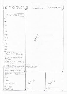
This is the contents page for my magazine. There will be three images on this, the biggest picture is of my main artist and the other two is of another artist who will be featured in the magazine. The big picture of my main artist will be in colour and the smaller images will be in black and white. I have headings such as "features" and "every week", showing what'll be in my magazine. Contents is at the top of the page with the date and the issue number again, also I have put the website name on there again incase they didn't see it on the front.
The text colours again will carry on from the front page, black, red, pinks etc.
This is my draft for my double page article. I will have four pictures on this. There will be a large main photo on the left hand side of the page, I have decided that this will be either a close up or a medium close up. At the right hand side, above the text, there will be a photostrip of three pictures. These will be a close up shot.
The headline will be a quote from the text, so it'll be in quotation marks. It will be also in large letters and, because I think my heading will be "it's all a bit crazy, isn't it," I will make the word "crazy" larger than the rest and in a different font; making it look more interesting. Underneath this there will be a little sub-heading, explaining a little about the article.
I will use a drop capital letter on the first letter of my first word (for example if the first word was "the" "T" would be larger than the rest of the word.) The text will be split up in three collumns because I think it looks more attractive and more professional that way. There'll be several text grabs used, to draw attention to specific words and phrases.
For colours, I will try to carry on the theme from the rest of my magazine, using the same colours etc. The headline will be in colour, with the word "crazy" in a different colour to the rest of the text. The sub-heading and text of the writing will be in black because it is the most legible colour, meaning no one will be straining their eyes to try to read it. The text grabs will be in the same colour that the word "crazy" will be in, just to keep a theme going and also having too many different colours can make it look messy or a bit busy. The background will be white.


Don't forget to add a mock-up for your double page spread at some point!
ReplyDelete