Friday, 31 December 2010
Feedback
Well done, Phoebe - virtually all planning done and evident on blog. Just some risk assessments and possibly a few plans for using the two weeks when we get back... Article is excellent and some promising photography work - you may just want to reshoot one or two to avoid chopping off the top of Amy's head - it wouldn't take long, as you know exactly the poses you want.... I look forward to seeing you start creating your pages...
Friday, 17 December 2010
Magazine photographs; front cover and contents page.
For the front cover and contents page of my magazine, I used the college studio to take my photographs. I took over 200 photos because this way I would have more choice for my magazine. I took a range of different shots; extreme close up, close up, medium close up and long shots. I also did different angles, low angle, high angle and canted angle. I also got my artist to stand in different positions, with different facial expressions. Below are possible pictures I will use for either my front cover or contents page.


This is one of the photographs I took. It is a close up and if I were to use it, it would be for my front cover. I like this one because she is looking straight in to the camera and smiling slightly. She is well lit so her face can be clearly seen. Looking into the camera helps for the artist to connect with the magazine buyer, also her body is bent towards the camera which also helps for her to connect with the reader. It is also a slightly low angle. The problem with this is that I have cut off some of her head, so this probably couldn't be used as a front cover.

This one is a medium close up. This would also be good for a front cover, because again she is looking in to the camera with her body facing forwards- like most magazine covers are. The fan was on whilst taking this, so her hair is moving which makes the picture look more alive and interesting. Fans are commonly used on magazine covers or contents pages.


The last two would be good to use as contents page because the text could easily fit around the images. The top one is a long high angle shot and the bottom one is a medium shot. She's looking in to the camera which helps her inteact with the reader and it's a different position to the front cover which makes it more interesting and adds variety.
Wednesday, 15 December 2010
Lists of equipment needed.
For my photographs, I will need to think about if I will have any props, what colours will be use, costume etc.
Props:
Props:
- Front cover- nothing.
- Contents page- Balloons?
- Double page article: Main Photo: Balloons? Photostrip: Kittens.
- Black
- White
- Bright colours.
- Fashionable clothing-
- leggins
- over-sized jumpers
- Curly/Wavey hair.
- High heels
- Painted nails.
- Medium Close up- front
- Long shot- contents page
- Close ups- photostrip
- Medium/long shot- main picture
Re-worked magazine article.
“IT'S ALL A BIT CRAZY, ISN'T IT?”
Princess of Pop, AMY GOULDSBROUGH, speaks exclusively to Pop Life. We catch up with the rising star as she discusses her new album, Katy Perry and Hollywood…
After the enormous success of her last album, and a year away from the spot light, she’s back! back with a bang! Not only is the album’s debut single, Bearded Kittens, racing towards the Number One spot, Amy has just signed a £50million contract deal with Sony Records.
Mild-mannered and shy don’t seem like the typical words to describe a pop star, but that’s exactly what she is. As she sits in her room, surrounded by pink walls plastered with band posters, she looks every bit the normal teenager, except she’s anything but. She’s the girl who has achieved 3 consecutive Number Ones and has had her album at Number One in the charts for 16 weeks straight- at just 16! “It’s all a bit crazy, isn’t it?” blue-eyed Amy smiles. “I never thought I’d be here; the amount of success I’ve had is amazing. I’m really lucky.”
Lucky, indeed! Only last year she was living in a semi-detached house in North West England, now it’s all about fancy restaurants, expensive shopping trips and luxurious holidays. But don’t think she’s not thankful for everything she’s received. “I think it’s important not to forget your roots, you know, who brought you here. I don’t think I would be where I am without the love and support I’ve gotten from my family and friends. I’m definitely living the dream now, though!”
Amy may be relatively new to the music scene, but it doesn’t mean the rumours haven’t started. “Yeah I’ve had a lot of bad press from the media lately. (The MTV awards incident with Miley Cyrus) I don’t want to go in to it, but, you know, I just want everyone who reads Pop Life to know that you shouldn’t believe everything you read in the tabloid newspapers. That stuff’s kinda hurtful," Amy sighs with a heavy heart. Not that bad press has ever stopped her. Her last album, Be Not Always, reached Number One and stayed there for 16 weeks, with three singles Be Not Always, Dance Nation and Get Down (On the Floor) all reaching Number One, all highly impressive for a début album.
Her last album produced up-beat, 70s-styled-disco, mixed with a modern pop sound; however, her latest album is a far cry from her previous one. “I wanted to do something different. Push the boundaries. It’s more…fun in comparison to my first album. The world’s a bit crap at the moment. I just wanna inject some fun and life in to it. Don’t take life too seriously.” She adds, “Hopefully, it’ll be more successful as my last.”
Well, with the first single, Bearded Kittens, well on its way to Number One, it’s looking that way and it’s been given good reviews from critics, with one claiming it’s “going to be the album of the decade” and another saying “she’s a new, young Beyoncé.” Big stars such as Katy Perry, Take That and will.i.am have all said they would love to collaborate with Amy, hailing her as “the next big thing.” The young star beams, “I’d love to work with Katy! She’s one of the reasons why I got into music.”
It seems like it’s all good news for Amy. Reports claim she has been offered a role in a big Hollywood film. Amy shyly turns her head away and says she can’t discuss that. Whether she’s going to Hollywood or not, all we know is that her first priority is still her music, “I’m very passionate about music, it’s what makes me tick and I hope I’ll be around for a very long time.”
All we can say is that we think she’s a new pop legend in the making.
This is my second version of the article. I have changed some things such as grammar and sentencing. The re-drafted article is often better than the original because it has been checked over for any mistakes in spelling or grammar and it reads and flows better. This makes it more sound professional and easily and enjoyable to read.
This is my second version of the article. I have changed some things such as grammar and sentencing. The re-drafted article is often better than the original because it has been checked over for any mistakes in spelling or grammar and it reads and flows better. This makes it more sound professional and easily and enjoyable to read.
Organisation of time during college hours.
This is a time table of how I will spend my remaining time during college before half term working on my blog. I will use frees and lesson time to help me do the most on my blog before half term.
Over the half term, I will carry on working on my blog making sure posts are up to the best standard and there is nothing else to add. Also, duing the half term I will take the remainder of my photographs for my contents page and double page article.
Once I return after the half term, I will carry on producing my magazine. Making sure it is all completed to an excellent standard before the 10 weeks are over.
The two weeks I have after half term I will be focusing on creating my magazine covers. If I am able to; I may stay behind after college one night a week to continue on the magazine and get a little more done. I will carry on with my front cover but I will do a bit on every page each lesson.
Saturday, 11 December 2010
Feedback
This is looking super, Phoebe - you have produced some good quality research and planning - just make sure you finish off any remaining tasks this week. I am really pleased with the work you have done.
My magazine article first draft.
Headline: It's all a bit crazy, isn't it. (quote from text)
Subheading: Princess of Pop, AMY GOULDSBROUGH, speaks exclusively to Pop Life. We catch up with the rising star as she discusses her new album, Katy Perry and Hollywood…
After the enormous success of her last album, she’s back! And she’s back with a bang! Not only is her debut single ‘Bearded Kittens’ racing towards the number one spot, Amy has just signed a £50million contact deal with Sony Records.
Mild-mannered and shy doesn’t seem like the typical words to describe a pop star, but that’s exactly what she is. As she sits in her room, surrounded by pink walls plastered with band posters, she looks every bit the normal teenager, except she’s anything but. She’s the girl who has achieved 3 consecutive number ones and has had her album at number one in the charts for 16 weeks straight- at just 16. "It’s all a bit crazy, isn’t it?" The wide, blue-eyed Amy smiled. "I never thought I’d be here, the amount of success I’ve had is amazing. I’m really lucky."
Lucky indeed, only last year she was living in a semi-detached house in North West England, now it’s all about fancy restaurants, expensive shopping trips and luxurious holidays, but don’t think she’s not thankful for everything she’s received. "I think it’s important not to forget your roots, you know, who brought you here. I don’t think I would be where I am without the love and support I’ve gotten from my family and friends. I’m definitely living the dream now though."
Amy may be relatively new to the music scene, but it doesn’t mean the rumours from the media haven’t started, "yeah I’ve had a lot of bad press from the media lately. I don’t want to go in to it, but you know I just want everyone who reads Pop Life to know that you shouldn’t believe everything you read in the tabloid newspapers. That stuff’s kinda hurtful", Amy sighs with a heavy heart. Not that this bad press is stopping her from going to the top spot. Her last album "Be Not Always" reached the number one spot and stayed at number one for 16 weeks, with three singles "Be Not Always", "Dance Nation" and "Get Down (On the Floor)" all reaching number one, which is very impressive for a début album.
Her last album produced an up-beat, 70s-styled-disco, mixed with modern pop sound; however, her latest album is a far cry from her previous. "I wanted to do something different. Push the boundaries. It’s more…fun in comparison to my first album. The world’s a bit…crap at the moment. I just wanna inject some fun and life in to it. Don’t take life seriously." She added, "Hopefully; it’ll be more successful as my last."
Well, with the first single "Bearded Kittens" well on its way to number one, it’s looking that way, and it’s been given good reviews from critics, with one claiming it’s "going to be the album of the decade." And with another saying "she’s a new, young Beyonce." Also big stars such as Katy Perry, Take That and will.i.am said that they would love to collaborate with Amy saying she’s "the next big thing." The young star beamed, "I’d love to work with Katy Perry, she is one of the reasons why I got in to music."
It seems like it is good news after the other for Amy; reports have claimed that Amy has been offered a roll in a big Hollywood film. Amy shyly turns her head away and says she can’t discuss that. Whether she’s going to Hollywood or not, all we know is that her first priority is music, "I’m very passionate about music. I hope I’ll be around for a very long time."
All we can say is watch this space.
Magazine Article.
This is part of an article from Q magazine. I am going to analyse the writing style of the magazine and this will help me to make sure my article is in the same writing style which will make it seem more professional.
"
ARCADE FIRE. BAND OF THE YEAR.
Teetering on a narrow metal rail in the middle of Madison Square Garden, Win Butler is enjoying a Rock Star Moment. If in the past there has always been a slightly tentative air about him as a frontman, tonight, on this, the second of Arcade Fire's rammed-to-the-rafters shows at the hallowed New York venue, his hesitancy appears to have gloriously evaporated. Midway through a pounding take on We Used To Wait, he exits the stage and enters the crowd, picking his way through them by attempting to balance like a tightrope walker on the lip of the safety barrier running all the way up the left hand side of the arena- not the simplest of tasks when you're 6'4" tall and in possession of size 15 feet.
Surrounding him are 19,500 ardent Arcade Fire fans, here witnessing what is effectively the launch of the Montreal septet's third album, The Suburbs, released two days previously here on 3 August; out there in broadbandland, another 1.8 million people are viewing his precarious antics via a live webcast being supervised by film director Terry Gilliam. Far behind him, onstage, the other members of Arcade Fire plough on through the song, while watching their now apparently fearless leader's preogress with a mixture of trepidation and delight.
Pummelling a piano centre stage, Butler's petite corkscrew-haired wife, Regine Chassagne is thinking, "Go,Win!" as her husband keeps a careful eye on this footing and-as he will later admit- firmly concentrates on "not falling to my death". Elsewhere, stage left, his younger brother Will Butler- like most of his bandmates a multi-instrumentalist, and the one most likely to perform such hair-raising stunts during an Arcade Fire show-thumps the keys of a vintage synth and views his sibling's escapade with an experienced eye. As the singer moves to the arena floor and is swollowed bythe mass, Will knows his brother will be alright. "Normally," he will later note, sagely, "you can tell by the state of the barricade if you're gonna get your shirt ripped off or if you're gonna be OK."
Presentation 1
This will help me when I write my article. Things I will need to keep in mind is;
- Not have too much text.
- Use text grabs, different coloured fonts etc to get attention
- Get to the point straight away so the reader knows what you are talking about
- Short sentences and paragraphs
- A mixture of informal and formal text, with no grammar or spelling errors.
Equipment and technology.
In order to complete my magazine and make it look as professional as possible, I will be using a range of different equipments and technologys.

- I will be using a camera from college to take my photographs

- Using different lights to get the best possible photos. This helps for my pictures to be well lit, this is especially important for the front cover.
- Using Photoshop to cut out pictures proficiently. Also, to edit pictures, for example changing the lighting, colour, adding effects etc.
- Using In Design in order to make my magazine.


Friday, 10 December 2010
Final Font Choice.
I have asked 10 people which colour in my font they liked the most. The results are as followed:
 The third font got the most votes, however, I'm not sure that is the best one to use for my magazine. It stands out, but it's not my favourite. I think I will use the yellow one because it stands out a lot and seems more 'poppy' than the others.

Magazine Layouts; Front cover, contents and double page article.

This is the layout for my front cover of my magazine. It's going to be a close up shot of my artist on the front, and no other images. Music magazines usually have a main focus of one artist on the front and just mention the names of the other artists featured in the magazine. I will put the artist center of the magazine with text around it. I haven't drawn my layout to scale, so the text boxes in my drawing are too small for text without it interfering with the image, so I will have to bring down some of the text boxes. There is also a barcode at the bottom with the website name and price of the magazine. And at the top next to my magazine name, there is the date and issue number of the magazine.
The image on the front will be in colour, and the writing of the text will be in colours such as black, red, pinks or purples etc. I am planning on having the background white, which is why black, red etc are good colours to use because they can been seen easily and are readable.

This is the contents page for my magazine. There will be three images on this, the biggest picture is of my main artist and the other two is of another artist who will be featured in the magazine. The big picture of my main artist will be in colour and the smaller images will be in black and white. I have headings such as "features" and "every week", showing what'll be in my magazine. Contents is at the top of the page with the date and the issue number again, also I have put the website name on there again incase they didn't see it on the front.
The text colours again will carry on from the front page, black, red, pinks etc.

This is my draft for my double page article. I will have four pictures on this. There will be a large main photo on the left hand side of the page, I have decided that this will be either a close up or a medium close up. At the right hand side, above the text, there will be a photostrip of three pictures. These will be a close up shot.
The headline will be a quote from the text, so it'll be in quotation marks. It will be also in large letters and, because I think my heading will be "it's all a bit crazy, isn't it," I will make the word "crazy" larger than the rest and in a different font; making it look more interesting. Underneath this there will be a little sub-heading, explaining a little about the article.
I will use a drop capital letter on the first letter of my first word (for example if the first word was "the" "T" would be larger than the rest of the word.) The text will be split up in three collumns because I think it looks more attractive and more professional that way. There'll be several text grabs used, to draw attention to specific words and phrases.
For colours, I will try to carry on the theme from the rest of my magazine, using the same colours etc. The headline will be in colour, with the word "crazy" in a different colour to the rest of the text. The sub-heading and text of the writing will be in black because it is the most legible colour, meaning no one will be straining their eyes to try to read it. The text grabs will be in the same colour that the word "crazy" will be in, just to keep a theme going and also having too many different colours can make it look messy or a bit busy. The background will be white.
Magazine layout inspiration.

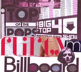
This Billboard magazine cover inspired my front cover. I like the positioning of Lily Allen because she is looking in to the camera, and it's a close up shot which is what most front covers have. It makes the artist and magazine look inviting and welcoming and it stands out and makes you want to pick up the magazine and read it. I changed mine slightly, for example I wont have the person on the cover of my magazine covering up the heading.

This contens page in Q magazine inspired my contents page. I like the layout of it because it's simple but attractive and interesting. I have change the design slightly to fit my genre more and I will look at more suitable colours for my magazine, rather than reds and black.
My double page article was an idea of my own and one was inspired from a page in OK magazine.
Wednesday, 8 December 2010
Fonts
I have decided to change my font from number 5 to number 8. This is because I think it looks more poppy, it's clearer and more attractive. It got a lot of votes, so I know people like it.


I have kept "pop" together and spaced out "life". It was done by accident at first, but I decided I liked it and I am going to keep my font in that style. I think it looks different and also the "life" being spaced out can suggest pop life, through different eras. A more spaced out and wider range of pop music, rather than just current pop music.
For font colour, I have decided that I'll do the word "pop life" in black with the 'o' in pop coloured in. I'm not too sure which colour so I am going to try it out and ask people which they like the best, or which appeals most to me and also I think I'll survey others too see which one appeals to them the most too.
I am going to try the colours, red, yellow, blue. These are the primary colours and they go well with black. I am going to keep it black because it looks more profesional and it is easier to read than other colours. I am going to add the colour in the middle of the "o" to make it stand out, and more interesting and more appealing to the audience.

Personally, I really like the "pop life" with the yellow "o", although I think they all stand out and look nice for my magazine heading. I am going to ask several people which one they think appeals the most to them.
Tuesday, 7 December 2010
Moodboard

This is a moodboard I did showing my ideas I have for my magazine. My moodboard shows the colours which I think would be good to use in my magazine, colours such as; reds, blues, pinks and yellows etc.
I have also put on some artists which would be the type of artists featured in my magazine because they are pop artists. They range from classic pop artists to current pop artists, people such as; Michael Jackson, Katy Perry, Queen and Beyonce etc.


My moodboard will help be to determine what my audience would be interested in, what colours to use, which artists to mention etc. I will use it as a guide when producing my magazine and also it is a quick look at the contents of my magazine.
Saturday, 4 December 2010
Research Feedback
Some very proficient and, in places, excellent research, Phoebe! You cover a good range of topics and achieve a good depth of detail, as well as taking care to use a nice range of presentation strategies. Keep using my comments to improve posts further. Do you have any more research tasks to complete? Well done on completing your prelim tasks.
Thursday, 2 December 2010
Magazine fonts.
I have asked people, from a range of ages, which font they'd like best for a magazine.
The results of the highest scored are as followed:

I like number 5 because when you look at it, you'd think of a pop magazine, it's different to other magazine fonts and I find it very interesting. It would catch the attention of people when they're looking at magazines and also it was the majority of the people I asked favourites, so it's more likely others will like the font also.
I'm not sure about what colours to do my font in yet.
The results of the highest scored are as followed:

- Font 5, 5 votes.
- Font 8, 4 votes.
- Font 6, 2 votes.
- Font 3, 2 votes.
I like number 5 because when you look at it, you'd think of a pop magazine, it's different to other magazine fonts and I find it very interesting. It would catch the attention of people when they're looking at magazines and also it was the majority of the people I asked favourites, so it's more likely others will like the font also.
I'm not sure about what colours to do my font in yet.
Wednesday, 1 December 2010
Magazine name and fonts cont.
I have decided the name of my magazine will be 'Pop Life'. I have chosen this, because my magazine is a pop magazine so having the word 'pop' in their helps people to know what sort of magazine it is. Also, it is a Prince song, so it is a play on words and some people would be familiar with it. It is also easy to remember and as the title suggests it's all about 'pop life'. Different eras of pop and pop artists etc. I also asked a couple of people which name would be best for a pop magazine, and they all said they liked 'Pop Life' because it reminded them off the Prince song.
I have gone on dafont.com and looked through a range of different fonts. I focused mainly on retro fonts because retro style is coming back in to fasion, especially in the pop world. Also, most of the retro fonts look quite modern but different to most fonts that get used for a pop magazine. I have chosen a few of my favourites and I will ask a range of people to decide which is their favourites and what works well for my magazine.
These are the fonts I will show people;

Tuesday, 30 November 2010
Magazine name and fonts.
As I've stated in my previous posts, a magazines name is very important. As is the fonts that the title is written in and the colours. It helps make the magazine stand out, and also, it helps the reader to know what sort of magazine it'll be, before they even read the rest of the magazine. It should be short and catchy and easy to remember.
Below are some images of pop magazine logos.


Below are some images of pop magazine logos.


Top of the Pops and Popstar! are magazines focused all about pop music, and Billboard and Rolling Stone magazines are a hybrid genre magazines, focusing on chart music or music in general, although the majority of it is pop music.
The names of each magazine are short, sharp and easy to remember. The colours of the magazines are very bright, using colours like the primary colours, such as reds, yellows, blues and also pinks. The fonts used are modern and eye-catching. Top of the Pops and Popstar! logos look very 'poppy' and definitely aimed at pre-teens/teenagers and at girls. This is because of the colours and the style of writing. Billboard and Rolling Stone look like they're aimed at both genders and an older teen market.
My magazine name should be simple, and short. I have decided to aim my magazine at modern pop and classic pop music. Therefore the title should reflect this as should the colours and the font.
I think for the name of my magazine, I have a few ideas;
- AGPop or AGP magazine standing for 'all genre pop'.
- Classic Pop
- Hollywood Tonight
- Jam
- Pop Junkie
- Pop Life
The names are short and simple and easily remembered. Like Rolling Stone magazine, some of the names are from songs or a play on words, which I think fit in perfectly for a music magazine. I will chose a range of fonts and then do a survey to find out what people find the most attractive
Institution
Magazines always have companies that will publish their magazines for them. This is because they can get lots of copies of the magazine printed very quickly.
I have searched some pop magazines and found out who publishes their magazines;

I have searched some pop magazines and found out who publishes their magazines;
- Smash Hits Magazine. Publishing company: EMAP Metro. EMAP Metro is a British media company. They have published other magazines such as Nintendo Official Magazine.
- Top of the Pops magazine. Publishing company: BBC Magazines. BBC Magazines published other magazines such as Girl Talk and It's Hot. BBC Magazines publishes magazines ranging from adult interests to pre-teen interests.
- Billboard magazine. Publishing company: Prometheus Global Media. They have published magazines such as Film Journal International. They publish a range of magazines, not just music magazines.
- Rolling Stone magazine. Publishing company: Wenner Media LLC. An American company.They've published other well known magazines such as Men's Journal and US Weekly.

It helps to have a big publisher because they will have all the equipment needed which helps to get copies printed quickly and also they will have a lot of money so they can advertise the product well. I think that with my magazine, I would look to BBC Magazines to publish my magazine because they have the most experience and knowledge when it comes to my target audience; they have specialized magazines for teenages and pre-teens, so I think the BBC Magazines would be the best option.
The BBC Magazines are usually based on existing television programmes, so I think if BBC Magazines were to publish my magazine, they would make a programme to do with it. For example it could be the new Top Of The Pops or another music programme. If there is an existing programme that is to do with my magazine, this could give my magazine a bigger audience and more people would be interested in buying it.
I think having failed that, Wenner Media LLC would be a good publisher to have. This is because they're an American based company and they'd be able to give my magazine a wider audience. So my magazine would appeal to English, Americans and other countries around the world.
Music Charts. Top 40- 28th November 2010.
These are the UK top 40 singles in the chart this week. The charts will help me see how much of my music genre is in the top 40 and where abouts in the chart they come
Although my previous post shows that the numbers of magazines being bought has gone down, this shows that pop music is still being bought and listened too. This is because pop music is for a mainstream audience, so if I did a magazine on pop music, it would be a much safer option than if I did more of a niche audience magazine because I'd always have a relatively large audience.
- X-Factor Finalists- Heroes
- Ellie Goulding- Your Song
- JLS- Love You More
- Olly Murs- Thinking Of Me
- Rihanna- Only Girl
- Take That- The Flood
- Far East Movement- G6
- Katy Perry- Firework
- Adele- Make You Feel My Love
- Rihanna- What's My Name.
- The Black Eyed Peas- The Time
- Cee Lo Green- Forget You
- Mike Posner- Cooler Than Me
- Bruno Mars- Just The Way You Are (Amazing)
- McFly -Shine A Light (feat. Taio Cruz)
- Alexis Jordan- Happiness
- Nelly -Just A Dream
- P!nk- Raise Your Glass
- Cheryl Cole- Promise This
- The Saturdays- Higher (feat. Flo Rida)
- Westlife -Safe
- will.i.am & Nicki Minaj- Check It Out
- Tinie Tempah -Written In The Stars (feat. Eric Turner)
- B.o.B -Magic (feat. Rivers Cuomo)
- Jessie J -Do It Like A Dude
- Duck Sauce- Barbra Streisand
- Tinchy Stryder -Game Over (feat. Chipmunk)
- Gyptian -Hold You
- Brett Domino -Gillian McKeith
- Swedish House Mafia Vs Tinie Tempah -Miami 2 Ibiza
- The Wanted -Heart Vacancy
- Taio Cruz -Dynamite
- Usher -More
- The Wanted -All Time Low
- Michael Bublé -Hollywood
- Eminem -Love The Way You Lie (feat. Rihanna)
- Gorillaz- Doncamatic (feat. Daley)
- The Beatles- Let It Be
- Olly Murs -Please Don't Let Me Go
- Kylie Minogue -Better Than Today
Although my previous post shows that the numbers of magazines being bought has gone down, this shows that pop music is still being bought and listened too. This is because pop music is for a mainstream audience, so if I did a magazine on pop music, it would be a much safer option than if I did more of a niche audience magazine because I'd always have a relatively large audience.
Music magazine circulation figures July 2010.
These are the current circulation figures for music magazines from 6 months ending June 2010. Some magazines post their circulation figures yearly, whilst others do it every 6 months.
From these circualtion figures, I have found out that only Kerrang! has made a profit of 1.8% (and Classic Rock hasn't made a loss or profit), and the rest have made a loss of a considerable amount since last year;
These are rather large losses, especially for leading magazines such as NME and Q. Although this isn't my music genre, this shows that magazines aren't doing that well. This could be down to a number of issues, for example, the genre may not appeal to a lot of people any more, their price may be too high and people on low incomes may not be able to afford the magazines or that they've simply lost interest in the contents of the magazines.
This is important for me because, even though this isn't my music genre, pop genre magazines may be going the same way (and it'll be unknown until they publish their curculation figures) so when producing a magazine I must find out the risks of what made these magazines lose numbers and see if I can stop it happening to my magazine.
Seeing as magazines aimed at my genre haven't yet posted circulation figues, I will look at the last two previous years figues to see if they have made a loss of profit.
(sources:
Ways magazines get around this is by;
From these circualtion figures, I have found out that only Kerrang! has made a profit of 1.8% (and Classic Rock hasn't made a loss or profit), and the rest have made a loss of a considerable amount since last year;
- Metal Hammer has lost 4.3%
- Mojo has lost 6.2%
- NME has lost 17.3%
- Q has lost 10.7%
- Uncut has lost 3.2%
These are rather large losses, especially for leading magazines such as NME and Q. Although this isn't my music genre, this shows that magazines aren't doing that well. This could be down to a number of issues, for example, the genre may not appeal to a lot of people any more, their price may be too high and people on low incomes may not be able to afford the magazines or that they've simply lost interest in the contents of the magazines.
This is important for me because, even though this isn't my music genre, pop genre magazines may be going the same way (and it'll be unknown until they publish their curculation figures) so when producing a magazine I must find out the risks of what made these magazines lose numbers and see if I can stop it happening to my magazine.
Seeing as magazines aimed at my genre haven't yet posted circulation figues, I will look at the last two previous years figues to see if they have made a loss of profit.
- Top of the Pops magazine. In December 2008 its circulation figure was 119,739 however, in December 2009 it's figure had dropped to 107,576.
- Hot Press magazine. In December 2008 its figures was 19,387 however, in December 2009 it had also dropped to 18,394.
- Rolling Stone magazine. In 2004 its figures were 1,267,110 and in 2005 that had risen to 1,309,117.
(sources:
http://dezji.wordpress.com/2010/02/18/uk-music-magazine-circulation-figures-to-dec-2009/
http://www.magazine.org/CONSUMER_MARKETING/CIRC_TRENDS/16117.aspx)
This means that my magazine will be competing against things like the internet. People are turning to the internet for music information because it's quick to access, free and simple to understand. Also, if your first language isn't English you can translate it over the internet, which you cannot do with a magazine. http://www.magazine.org/CONSUMER_MARKETING/CIRC_TRENDS/16117.aspx)
Ways magazines get around this is by;
- Putting their magazine online. So not only is their a magazine you can buy, you can go online and get more up-to-date information.
- Having freebies in the magazines.
- Having 4 magazines for the price of 1. For example, OK magazine has three extra magazines inside it's main magazine.
- Making their magazine cover look attractive and interesting and making sure they have interesting subjects inside their magazine. People would buy a magazine if it was the latest news which the magazine claims can only be read in their magazine.
Journalistic Style
Journalistic style is the way in which journalists write and report their article. Whilst writing, they take in to account things like; vocabulary, sentencing, the information given and the tone in which they write to make sure it's suitable for their audience. They also use the 5 W's when writing; Who, What, Where, When, Why and also How.
A magazine artical will always consist of this sentencing structure;
This is an album review of Kanye West's new album "My Beautiful Dark Twisted Fantasy" from the website of Billboard Magazine. The review isn't very long, as this keeps the attention of the readers. This review uses a "soft lead" to open the review up. It starts with the line; "Fresh off his media-storm-induced hiatus that followed his now-infamous hijacking of Taylor Swift's acceptance speech..." It starts with something that is irrelevant to his album, but something that will catch the readers attention. When Kanye West interrupted Taylor Swift at the MTV awards in 2009, people will always refer Kanye to this incident. Therefore, journalists start an artical mentioning this and automatically the reader reads on.
The tone of voice used in the text is friendly, like the writer is talking to you personally. And also the words used aren't too hard to understand. This is because of the audience it is aimed at. It is aimed at teenagers and early 20's, so they have written it like you are being spoken too by the writer personally because this appeals to them the most.
No article is ever random there is always a point behind it. The point of this article was to review Kanye Wests new album, drawing attention to it, and in this case, it was good attention.
There is also no spelling or grammar mistakes in this article, which is very important. This is because they get editors to check the article before it is printed or published.
This has helped me when writing my own article, I will make sure I get straight to the point so the audience know what and who I am talking about. I will try and get the right tone of voice for my audiece, so it appeals to them and that they'll want to read it etc. Also, I will make sure someone proof reads my article to make sure there is no spelling or grammar mistakes.
A magazine artical will always consist of this sentencing structure;
- Heading. The headline is usually short and sweet and an incomplete sentence- for example "Obama Seizes Historic Win"
- A subheading. A sentence or two giving a short teaser about the artical.
- The story. The artical usually starts with what is called a "lead" or "intro". It is the very first sentence in an article and it is used to sum up the whole of the article. There are two types of leads. First there is a "hard lead". Where they write a comprehensive thesis, which tells the reader what the article will cover. Or there is a "soft lead", which is a more creative way of starting the sentence. If the writer uses a "soft lead" then they will usually follow this by using a "nut graph" which is facts. Once they have written their lead, they then go on to the rest of the artical. The lead is important because it is what grabs the readers attention and gets them to carry on reading.
This is an album review of Kanye West's new album "My Beautiful Dark Twisted Fantasy" from the website of Billboard Magazine. The review isn't very long, as this keeps the attention of the readers. This review uses a "soft lead" to open the review up. It starts with the line; "Fresh off his media-storm-induced hiatus that followed his now-infamous hijacking of Taylor Swift's acceptance speech..." It starts with something that is irrelevant to his album, but something that will catch the readers attention. When Kanye West interrupted Taylor Swift at the MTV awards in 2009, people will always refer Kanye to this incident. Therefore, journalists start an artical mentioning this and automatically the reader reads on.
The tone of voice used in the text is friendly, like the writer is talking to you personally. And also the words used aren't too hard to understand. This is because of the audience it is aimed at. It is aimed at teenagers and early 20's, so they have written it like you are being spoken too by the writer personally because this appeals to them the most.
No article is ever random there is always a point behind it. The point of this article was to review Kanye Wests new album, drawing attention to it, and in this case, it was good attention.
There is also no spelling or grammar mistakes in this article, which is very important. This is because they get editors to check the article before it is printed or published.
This has helped me when writing my own article, I will make sure I get straight to the point so the audience know what and who I am talking about. I will try and get the right tone of voice for my audiece, so it appeals to them and that they'll want to read it etc. Also, I will make sure someone proof reads my article to make sure there is no spelling or grammar mistakes.
Sunday, 28 November 2010
Target audience questionnaire
To fully understand my target audience, I have devised a questionnaire. This will help me understand my TA and with their answers it can help be make my magazine suitable for their needs and wants.

Additional comments:
These are what two people said would make them buy a magazine;
"It’s important in media to cover the whole spectrum of music. From mainstream to underground from past to present. If I saw everything in different genres as well as mainstream through underground and like past interviews of ‘old school’ artists maybe with like, an update too. Variety sales because people now a days are interested in so many different views, plus more ‘walks’ of life would buy a music magazine too."
and
"Something free in those pages."
So, again, variation is important to many people who have an interests in many music genres. Also, people like free gifts in their magazines, which may be the difference between someone buying your magazine or a magazine with a free gift.
I gave out the questionnaire to 10 people, out of the 10 there was;
- One 12's
- Two people aged 13-14
- Three people aged 15-17
- Four people aged over 18
From the results of the questionnaire, I have found out that pop is the most popular genre with 6 out of the 10 people asked. There was at least one person from each age category that chose pop as their favourite genre. The most popular age group that chose pop was the over 18 category (3 out of the 4), which did come as a surprise as I thought the 13-14s would chose pop as their favourite. However, pop wasn't the only genre chosen. As well as pop, people ticked soul or indie as their favourite genre of music. This shows that people have a varied music taste and like more than one type of music. But it does show that pop music is popular.
When asked if they bought music magazines; four people left the question out, two answered "no" and four answered "yes". The reasons the two answered no was because:-
- of lack of availibility
- couldn't find a magazine that appealed to their music genre preference
- didn't have their favourite artist in that often
The four that answered yes was because:-
- They like reading reviews of artists they like and they like finding out about new artists
- Music is their life, so they enjoy reading about all aspects of music
- If they see something on the cover that is interesting, they'll buy it.
- They like knowing what's going on in the musical world and like being up-to-date
This shows that music magazines are still being bought, as people like to read about their favourite artists or like learning about new artists. Also, people like being kept up-to-date with everything that's going on and that if the cover of a magazine looks interesting, then some people will go and buy it. However, it does show that perhaps magazines aren't easily accessable everywhere, whether that's to do with where they live or if magazines don't get distributed to their local shops. Also, that perhaps magazines don't show enough varied artists. Some magazines show the same artists in a magazine each time which can put people off from buying a magazine.
When it came to the question with price, everyone who answered said they would pay over £2 for a magazine. This did come a shock, as I thought everyone would want to pay as little as possible. However, they said that if it was something they really wanted, they would pay whatever the price is. Having said that, I think it's still important not to set the price too high as this could put off people who doesn't have a high socio economic status. And also, if my magazine and another magazine have the same person on the front, they would go for the cheaper magazine of the two, which is another reason to set the price pretty low.
The parts of magazine people said they liked were things like;
- Reviews of up-coming albums
- Everything
- Articles on artists, mostly new up-and-coming artists
- Pictures
- Interviews
- Charts
- Quizzes
- Gossip pages
- Advertisements (although they recognised they were essential)
- Lack of variety
- Price
- Giving unfair comments to artists that are just starting out
- When they write about an artist or band, without doing their research
- Horoscopes
Additional comments:
These are what two people said would make them buy a magazine;
"It’s important in media to cover the whole spectrum of music. From mainstream to underground from past to present. If I saw everything in different genres as well as mainstream through underground and like past interviews of ‘old school’ artists maybe with like, an update too. Variety sales because people now a days are interested in so many different views, plus more ‘walks’ of life would buy a music magazine too."
and
"Something free in those pages."
So, again, variation is important to many people who have an interests in many music genres. Also, people like free gifts in their magazines, which may be the difference between someone buying your magazine or a magazine with a free gift.
Target audience.
I will try and identify my target audience by using GRASS.
Gender: Mostly girls.
Race: All races
Age: Pre-teens and teenagers/young adults (early 20's)
Socio-economic Status: It can range in to different categories. If they don't work then they'll fit in to the D's and E categories. If they have a part time job, they could fit in the C categories, and if their parents work then they could again fit in to the A-C catagories.
Ideal reader:


This is what my ideal readers would look like, any ethnicity or teenager (13-18) reading it. They'd have posters of their favourite artists in their rooms, read the magazines alone or together with their friends etc.
Gender: Mostly girls.
Race: All races
Age: Pre-teens and teenagers/young adults (early 20's)
Socio-economic Status: It can range in to different categories. If they don't work then they'll fit in to the D's and E categories. If they have a part time job, they could fit in the C categories, and if their parents work then they could again fit in to the A-C catagories.
Ideal reader:
- In the age range of 11-20
- Living at home with parent/s/guardian
- Like pop music. Current artists as well as older artists.
- Buy CDs, music DVDs, download music via iTunes etc.
- Attends concerts, although doesn't have to.
- Likes films like teenage rom-coms
- Likes TV shows such as reality TV shows, music chart shows.
- Spend their money on my magazine, their favourite artist/band merchandise


Saturday, 27 November 2010
Pop music research.
Pop Music:
Pop music (or popular music) is a very mainstream genre. Pop music has been popular all around the world ever since it was first brought to the music world.
The term "Pop music" originated in Britain in around the 1950s.
Pop music has around 16 sub-genres which include; "bubblegum pop", "dance-pop" and "teen pop". Pop music is a genre made up of many other genres such as "rock and roll", "dance" "R'n'B" etc. However, "rock and roll" music influenced pop music the most and pop music can been seen as a softer alternative to rock music.
Musicologists often identify the following characteristics as typical of the pop music genre:
Musicians such as The Beatles, Michael Jackson (possibly being the most influential) and Bob Dylan have helped shape, change and influence pop music as it is seen today. Also, the record lable Motown have helped change the way we see pop music. Many of what these artists used and invented while they were performing have influenced current popstars. Their methods are being used time and time again to ensure number one singles and hit records.
 Artists that have helped shape pop music;
 Typical instruments used in pop music are;
Picture above shows; Madonna using a microphone. A microphone is the most important instrument an artist uses because their main purpose is to sing and a microphone helps project their voice. Prince is shown with a electric guitar. An electric guitar is another popular instrument that many artists use, especially if they are mixed genre; for example rock and pop. The Pet Shop Boys use instruments such as synthesiszers. This helps them create a futuristic pop sound. Lastly The Carpenters use instruments such as the drums. Drums are another important instument, it helps keep the beat and also having drums means it's easier for people to dance to the songs. In photoshoots/magazine covers pop artists are usually pictured holding these instruments as these are the typical instuments they use in their music.
Colours:
Pop artists can wear a range of different colours, however, they usually use/wear bright, attractive colours. This is because, although pop artists try to appeal to every type of people, they mostly appeal to a younger audience. The colours are attractive and friendly. Also, the colours help reflect the type of songs that they sing. For example, if they are singing about love and relationships, the colours are bright and happy- reds, yellows etc. Or if they are singing about heart break, the colours are more darker- blues, blacks, purples. White is also a common colour with pop artists, especially the younger artists, as this symbolises purity and innocence and that is the image they are projecting to the public.
 Britney Spears in the picture above is from the music video "Oops I did it again". She is wearing red as the song is typically a love song and red can symbolise love. Also, it can symbolise seductiveness and with the lyric "I'm not that innocent." therefore, in this case the red symbolises love and seductiveness. Beyonce is wearing all white from the performance "Halo". The white symbolises innocence and purity. Halo has been sung about Michael Jackson and also for the Haiti earthquake victims, therefore white reflects the innocence of the subject/s that this song is about. Katy Perry is pictured wearing yellows, green and pink. These are typical colours for a pop artist to wear. This is because it helps appeal to their audience and they are colours their audience is familiar with; bright and colourful. Michael Jackson in the picture is from the music video "She's out of my life". The song is a very sad song, and although it is about love, it isn't a happy love song, as the title suggests, it's about someone who has left their life and therefore it is a song about heartbreak. He is wearing blue to reflect the mood of the song and his feelings. Blue is a symbol of sadness and upset therefore, this is why he has chosen to wear blue in the video.
Costume:
Pop artists don't have a 'typical' costume. Depending on who they are influenced by, if they are a mixed genre and so forth, depends on what costume they'll wear. Also, pop artists try to make themselves different and unique to other artists of the same genre, so they'll wear 'outrageous' clothing or sometimes, very little clothing. This helps for them to try to appeal to their audience, and also appeal to other audiences who may not typically listen to their music, but may be intrigued by the way they dress. If they are posing for a cover of a magazine, they tend to 'dress down' a bit, not wearing such outrageous cloths or wearing outfits that will fits in with the style of magazine they're featuring in. Also, most pop artists tend to start out when they are fairly young, so when they grow up their costumes can change dramatically so they don't look like a 'child star' anymore and more grown up, helping them appeal to pre-teens, teens and an older generation. However, most of their costumes have similarites. This is because they usually go to the same designer to get their clothes made; for example, stars such as Katy Perry, Lady Gaga and Beyonce have all been styled by Jean Charles de Castelbajac. So, although they get them styled to look 'different' they do have similarities.
 The image shows outfits worn both by Katy Perry and Lady Gaga, which have been designed by Jean Charles de Castelbajac. Although, they were both going for the 'different' and 'unique' look, they both are wearing an outfit with The Muppets on their dresses. Also, both of their costumes are large and bold with colour, another typical trait for an pop artist.
Also, designers and pop artists take inspiration from other artists. For example, Balmain designed clothing for Rihanna and Beyonce which take inspiration from Michael Jackson's military styled jacket.
 Balmain did a Michael Jackson inspired clothing line, which many celebrities have worn. Michael wore some designes by Balmain back in 2009 and after his death Balmain decided to draw inspiration from previous clothes he has worn. Rihanna is seen wearing a military demin jacket, similar to what Michael wore in 1996. And Beyonce is seen wearing a military jacket, very similar to what Michael wore during This Is It rehearsals.
Props:
Pop musicians usually have the same props whether they're on stage or in a photoshoot or on a cover of a magazine. Their pops are usually their instruments or something they add to their costume. For example, a microphone or guitar could be their prop. Although, not all artists have props. Again, taking Michael Jackson as an example, his fedora, glasses, glove, socks and finger tape can be seen as his 'props'. Something he adds to his costumes or he wears when on tour or just around on the streets.

To make my product seem authentic, I need to take in to concideration all these main points and add them to my magazine and to the artists featured in the magazine. I will need to decide whether I will include instruments, and decide what will be appropriate to make it look believable. I will have to look at the colours the artist will wear, depending what they are promoting. If it is a new single about love, then the colours will be colours like reds and pink. If it is about heartbreak and upset, they will be darker colours. And if it is promoting an album in general, the colours will be bright and neutral like yellows, and soft pinks etc. Costumes and props are also something to think about.
Pop music (or popular music) is a very mainstream genre. Pop music has been popular all around the world ever since it was first brought to the music world.
The term "Pop music" originated in Britain in around the 1950s.
Pop music has around 16 sub-genres which include; "bubblegum pop", "dance-pop" and "teen pop". Pop music is a genre made up of many other genres such as "rock and roll", "dance" "R'n'B" etc. However, "rock and roll" music influenced pop music the most and pop music can been seen as a softer alternative to rock music.
Musicologists often identify the following characteristics as typical of the pop music genre:
- Appealing to a wider audience, rather than a specific type of people; for example appealing to black and whites, men and women, young and old.
- An emphasis on craftsmanship rather than formal "artistic" qualities; for example getting a formula which works and using it over and over again to keep producing hit songs.
- An emphasis on recording, production, and technology; for example having numerous amout of 'takes' until they deem the song as 'perfect',
- Tendency to reflect existing trends; for example taking influence from music that is popular with the public and using it to help create their 'sound'.
- Pop music is usualy used to encourage dancing; for example if it encourages dancing it can be played in night clubs and other places making it more popular.
Musicians such as The Beatles, Michael Jackson (possibly being the most influential) and Bob Dylan have helped shape, change and influence pop music as it is seen today. Also, the record lable Motown have helped change the way we see pop music. Many of what these artists used and invented while they were performing have influenced current popstars. Their methods are being used time and time again to ensure number one singles and hit records.

- Motown records (The Jackson 5 pictured). The Jackson 5 were the last successful band to come from Motown and have helped influence many artists with their songs such as 'I want you back' 'ABC' 'Dancing Machine'. They were very much the 'bubblegum pop' genre. And they continued to be successful once they left Motown and became The Jacksons, producing influential songs such as 'Blame it on the boogie' 'Can you feel it' and many more.
- The Beatles are one of the most influential groups ever to have formed. They have had countless number of hits and their music continues to inspire bands today. They are a mixture of Rock and Roll and Pop genre.
- Michael Jackson, possibly the most influential artist to have ever lived. From being in the musical world for the whole of his life, he has been able to change the way pop music has formed and has inspired men, women, blacks, whites, the young and the old. His techniques are still being used today by current artists and he continues to inspire many musicians. His music is a mixture of many genres.
- Elvis Presley, again an inspiration to pop music. Again, he is a mixture of many genres including rock and roll.

- Vocals
- Electric/Bass Guitars
- Drums
- Keyboards
- Piano
- Accustic guitar
- Synthesizers
- Drum machines
- And many others.
Picture above shows; Madonna using a microphone. A microphone is the most important instrument an artist uses because their main purpose is to sing and a microphone helps project their voice. Prince is shown with a electric guitar. An electric guitar is another popular instrument that many artists use, especially if they are mixed genre; for example rock and pop. The Pet Shop Boys use instruments such as synthesiszers. This helps them create a futuristic pop sound. Lastly The Carpenters use instruments such as the drums. Drums are another important instument, it helps keep the beat and also having drums means it's easier for people to dance to the songs. In photoshoots/magazine covers pop artists are usually pictured holding these instruments as these are the typical instuments they use in their music.
Colours:
Pop artists can wear a range of different colours, however, they usually use/wear bright, attractive colours. This is because, although pop artists try to appeal to every type of people, they mostly appeal to a younger audience. The colours are attractive and friendly. Also, the colours help reflect the type of songs that they sing. For example, if they are singing about love and relationships, the colours are bright and happy- reds, yellows etc. Or if they are singing about heart break, the colours are more darker- blues, blacks, purples. White is also a common colour with pop artists, especially the younger artists, as this symbolises purity and innocence and that is the image they are projecting to the public.
Costume:
Pop artists don't have a 'typical' costume. Depending on who they are influenced by, if they are a mixed genre and so forth, depends on what costume they'll wear. Also, pop artists try to make themselves different and unique to other artists of the same genre, so they'll wear 'outrageous' clothing or sometimes, very little clothing. This helps for them to try to appeal to their audience, and also appeal to other audiences who may not typically listen to their music, but may be intrigued by the way they dress. If they are posing for a cover of a magazine, they tend to 'dress down' a bit, not wearing such outrageous cloths or wearing outfits that will fits in with the style of magazine they're featuring in. Also, most pop artists tend to start out when they are fairly young, so when they grow up their costumes can change dramatically so they don't look like a 'child star' anymore and more grown up, helping them appeal to pre-teens, teens and an older generation. However, most of their costumes have similarites. This is because they usually go to the same designer to get their clothes made; for example, stars such as Katy Perry, Lady Gaga and Beyonce have all been styled by Jean Charles de Castelbajac. So, although they get them styled to look 'different' they do have similarities.
Also, designers and pop artists take inspiration from other artists. For example, Balmain designed clothing for Rihanna and Beyonce which take inspiration from Michael Jackson's military styled jacket.

Props:
Pop musicians usually have the same props whether they're on stage or in a photoshoot or on a cover of a magazine. Their pops are usually their instruments or something they add to their costume. For example, a microphone or guitar could be their prop. Although, not all artists have props. Again, taking Michael Jackson as an example, his fedora, glasses, glove, socks and finger tape can be seen as his 'props'. Something he adds to his costumes or he wears when on tour or just around on the streets.

To make my product seem authentic, I need to take in to concideration all these main points and add them to my magazine and to the artists featured in the magazine. I will need to decide whether I will include instruments, and decide what will be appropriate to make it look believable. I will have to look at the colours the artist will wear, depending what they are promoting. If it is a new single about love, then the colours will be colours like reds and pink. If it is about heartbreak and upset, they will be darker colours. And if it is promoting an album in general, the colours will be bright and neutral like yellows, and soft pinks etc. Costumes and props are also something to think about.
Subscribe to:
Comments (Atom)